Using about 500 words of Lorum Ipsum (or other dummy text) you are going to design three different pages:
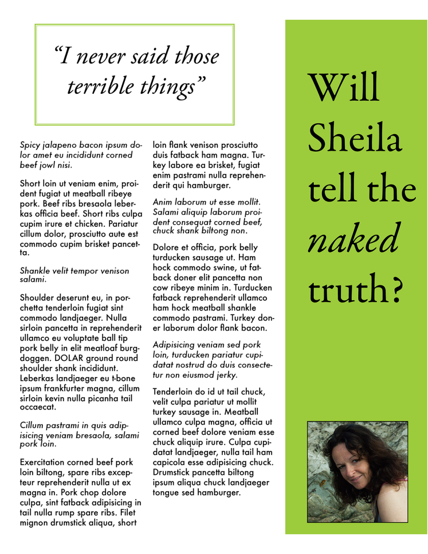
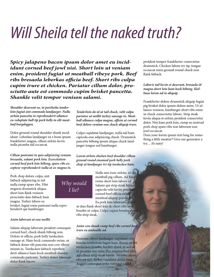
• an interview with a TV actor in a listings magazine entitled: Will Sheila tell the naked truth?
• a review of a new piece of hardware or software in a specialist computer magazine
• a book review in a newspaper’s weekend edition.
Research these types of publications and identify three different combinations of typefaces appropriate for each publication.
Now you need to invent headings and subheadings for your articles. Set these combinations so that your header is above 12pt in size, your body text is 12pt or below and subheadings sit in between in your hierarchy.
You will need to create some text to allow you to show your combinations in action. Use your text to describe your decision making process, why you think the combination works and what your intentions were.
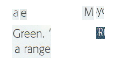
I looked up some listing magazines – we do not get any of these as we do not watch a lot of television. When we do we watch the news and the occasional documentary. The first interview I found on a magazine called “BUZZ”
The heading was in Franklin Gothic pt size 36. The body of the text was Helvetica Neue 14pt with the questions in the same font but Bold. Because this is online the pt size used is bigger than it would be in an equivalent printed magazine. Sans serif also reads very easily online. Both heading and body text are clean and simple.
The next magazine I looked at was called, appropriately “Interview”. I loved the cover. The online interview was in Georgia 14 both questions and answers, The questions were in Upper Case.
I loved the typeface of the Title but could not figure out what it was.
I am sure that the printed version would use different body font.
Some of the other magazines I could not work out what fonts were being used. One about Reggae interviews was impossible to read. I also looked at an interview with Sarah Jessica Parker in Red. I have no idea who she is (this is my problem I never know who these people are). But I do know this magazine as my daughter reads it.It was easy to read but an unusual way of doing an interview.
Sarah Jessica Parker is trying to resist sending an email. It’s a reminder to her husband, Matthew Broderick, to make sure a school form has been signed and returned, and that their son James Wilkie needs to clear out his backpack tomorrow, as he does every Wednesday.
“There’s a file under his desk and all his papers from the week – whether it’s Latin or history – have to go in.”
There are no questions and Answers it is a story format. I like it.
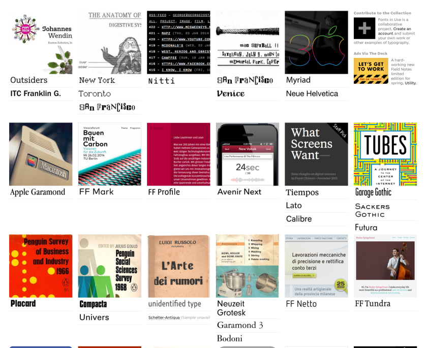
There are many online sources about pairing fonts.
this shows combinations of fonts for different publications. Most are not free fonts but some are.
I have printed the first task headline and a little text with a number of heading/body text combinations. I’ve pasted these into my learning log. With the fonts that I have available I like the following combinations:
Garamond/Futura
Myriad/Minion
I then tried out a number of layouts in my learning log. I had some images of my lovely daughter and decided to use one or two of these. I find my two final layouts dull but then I find most of the women’s magazines layouts, which I looked at, really dull.
2. A single screen snap from the hundreds of typography pairings for technical magazines on this site.
I made some sketches in my log book:
I then researched technical backgrounds and found amazing images on this site. But these all looked a little too advanced for my present Illustrator skills. I used this site for a very simple background which showed me how to create a Mesh gradient.
I then added a cloud. I first made the colour pale blue but finally decided white was better.
Using my log book sketch for ideas I added a mobile phone, a laptop, an envelope as the software was a cloud storage software. I then added rectangles into which I would put the text. I decided to use Myriad in both headlines and text as I find it very clean and readable. I did all of these steps in different layers as the whole was quite complicated. I sent it to a couple of friends for comment. I have not used all the 500 words as I felt that this would probably be a two page spread and the rest of the text could be used.
REFLECTIONS:
JO: ARTIST
I think the poster is great – love the central cloud and mauve is sufficiently soft yet bold ( sounds bonkers), but also one can read the text in white against it.
I suppose my boy comment would be whether there needed to be a link between the images ( eg mobile) and text. Would any text be an explanation of the object illustrated within the context of the whole concept? Does that make sense? Tricky, as text is gobbledygook.
It is, however, hugely eye-catching with relevant central motif.
But what do I know about these things!
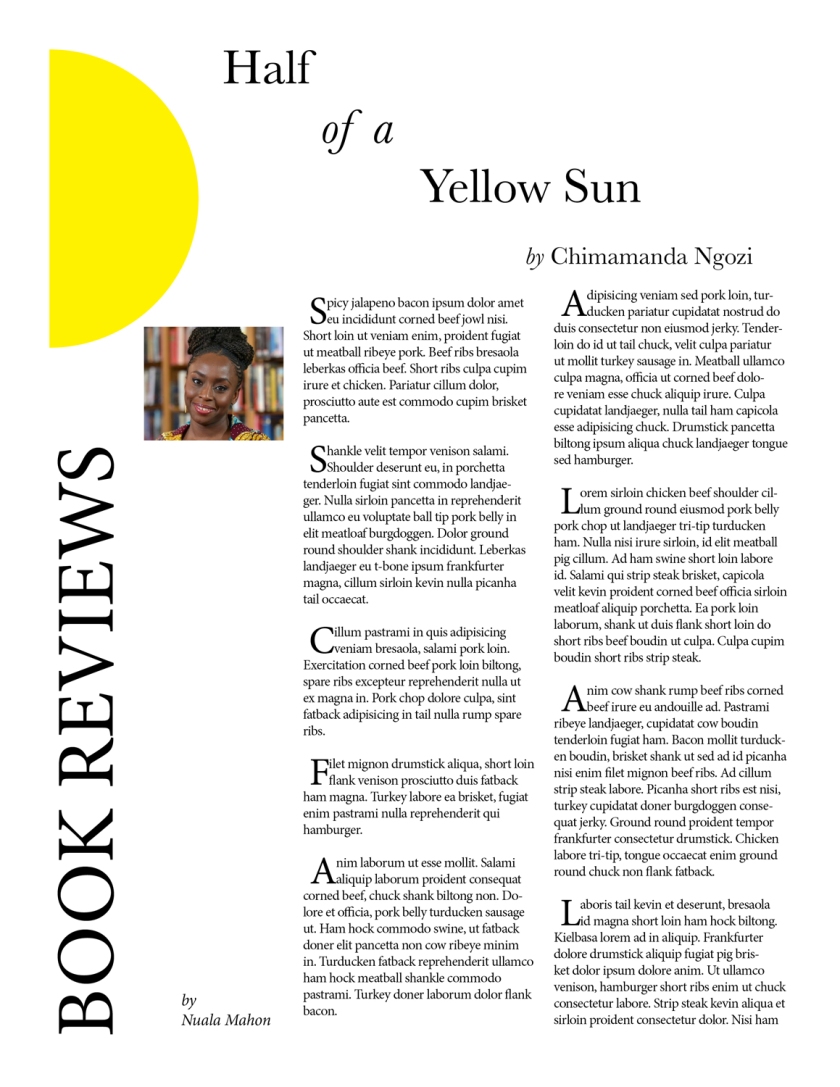
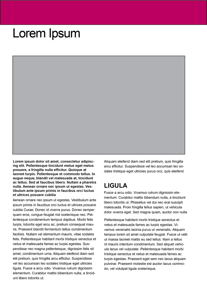
3. The final task is to make a layout for a book review. I found this the simplest. I love books and I absolutely adore the works of Chimamanda Ngozi Adechi. I decided to do a review for Half of a Yellow Sun.
I made a few layout mock-ups in my log book:
I used the tried and tested Baskerville at 36pt for the titles. I used Minion Pro for the BOOK REVIEW title and for the body text at 10pt. This still did not allow me to fit all 500 words into the space. So I reduced the tracking to -25. I am not sure if this reduced the readability beyond tolerable. I got most of the 500 words in but not all. I like the two serifs for a book review. I think it is comfortable to read. I wanted to break up the paragraphs with the drop caps. I only used two lines for the Drop caps.
Now select one of the designs from your research that you like and think works. Using the dummy text, try and copy the layout and design as closely as possible. You will need to measure the margins and column widths. If you don’t have the exact typeface get as near as you can. If you are copying a page that includes photographs just leave 10% tinted boxes to indicate their position.
Is the type serif or sans serif? Is the text set ragged or justified? Are there spaces after paragraphs or are new paragraphs indented? How many columns are there to a page?
What happens when you alter the fonts, change the alignment, adjust the leading or tracking?
Now try another, different publication from your collection.
I looked at a number of publications and answered the questions above as best I could. The most difficult for me is to identify the fonts used.
Here are my notes in my learning log.
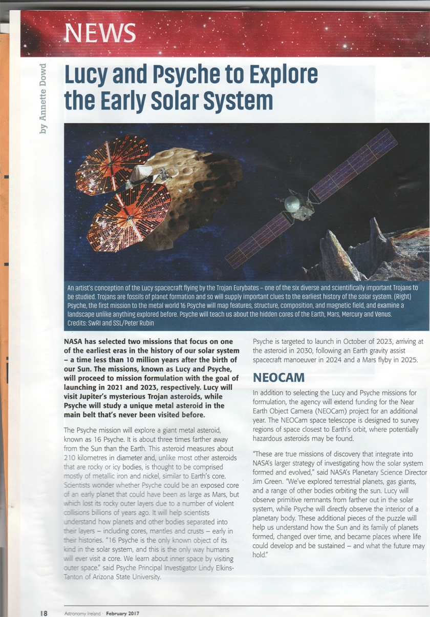
I asked my husband which article he found easiest to read. He had no doubt it was Astronomy Ireland. Interestingly it had sans serif in both headline and body text.
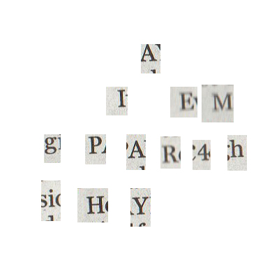
I looked at all the characteristics of the letters and then looked up http://www.identifont.com What it gave me was Fedra Sans thin Display Codensed which seemed correct based on the following letters which I copied and pasted into Photoshop.
This font does not seem to be available either to download or buy. I thought Tahoma was near it and Ariel nearer. I did five or six copies of the text using either Tahoma or Ariel and altering the leading and tracking. I seemed to have overwritten 3….
Font used
pt size
leading
tracking
1
Tahoma
12
18pt
0
2
Tahoma
12
14pt
(-10)
4
Tahoma
9
14pt
(-10)
5
Tahoma
9
14pt
0
6
Ariel
9
14pt
0
7
Ariel
10
14pt
0
The last version seemed to fit the closest although it is not very close. I put them all into my learning log.
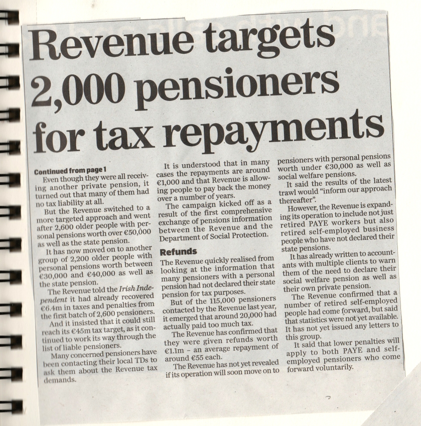
For my second task I chose the Independent article as I wanted to try a newspaper story.
I now tried to identify the font using Identifont.com.
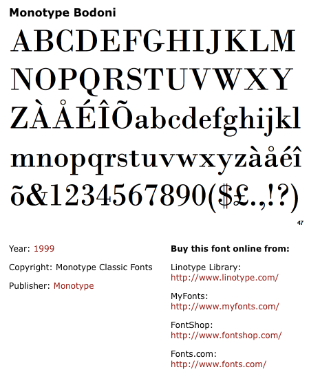
It came up with the following: Monotype Bodoni which looks very similar
I tried Bodoni.
First thing I learned was the paragraphs were justified with the last line aligned left. I had not noticed this..
The paragraphs were indented
headline is similar to American typewriter but I could not identify it despite the “R” being so distinctive. American Typewriter has a similar “R”The point size seems to be 40
Create your own sample book of typefaces on your computer that you can refer to.Organise them into:
• Serif for continuous text; readable at small sizes and those suitable for headings.
• San-serif for continuous text; readable at small sizes and for headings.
• Script fonts that look handwritten with a pen or brush.
• Decorative fonts only suitable for headings or ‘fun’ uses.
• Fixed width, techno and pixel fonts for use on the web or to give a computer appearance.
Identify which typefaces have bold, italic, black or light fonts.
Now identify which fonts you might use in each of the following commissions:
A short story in a woman’s magazine entitled “I thought I loved him; now I’m not so sure”. The story is 1300 words long so you will need to identify a text font and a headline font.
An advertisement in a parish magazine asking for more helpers on the flower rota. The finished size is A6 landscape and the text reads: “Can you add that important artistic flourish to our church? We desperately need more volunteers to join the flower rota. If you can help or would like more information please contact Jennie jennie@vicarage.co.uk.”
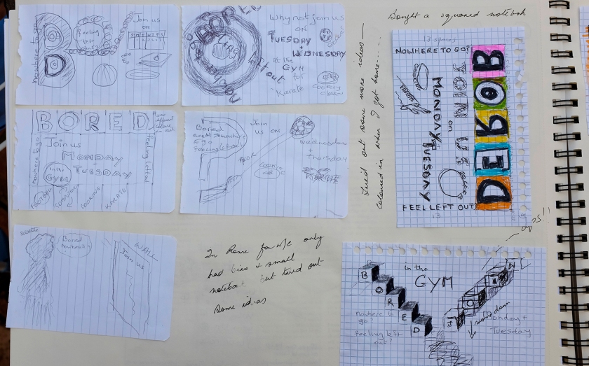
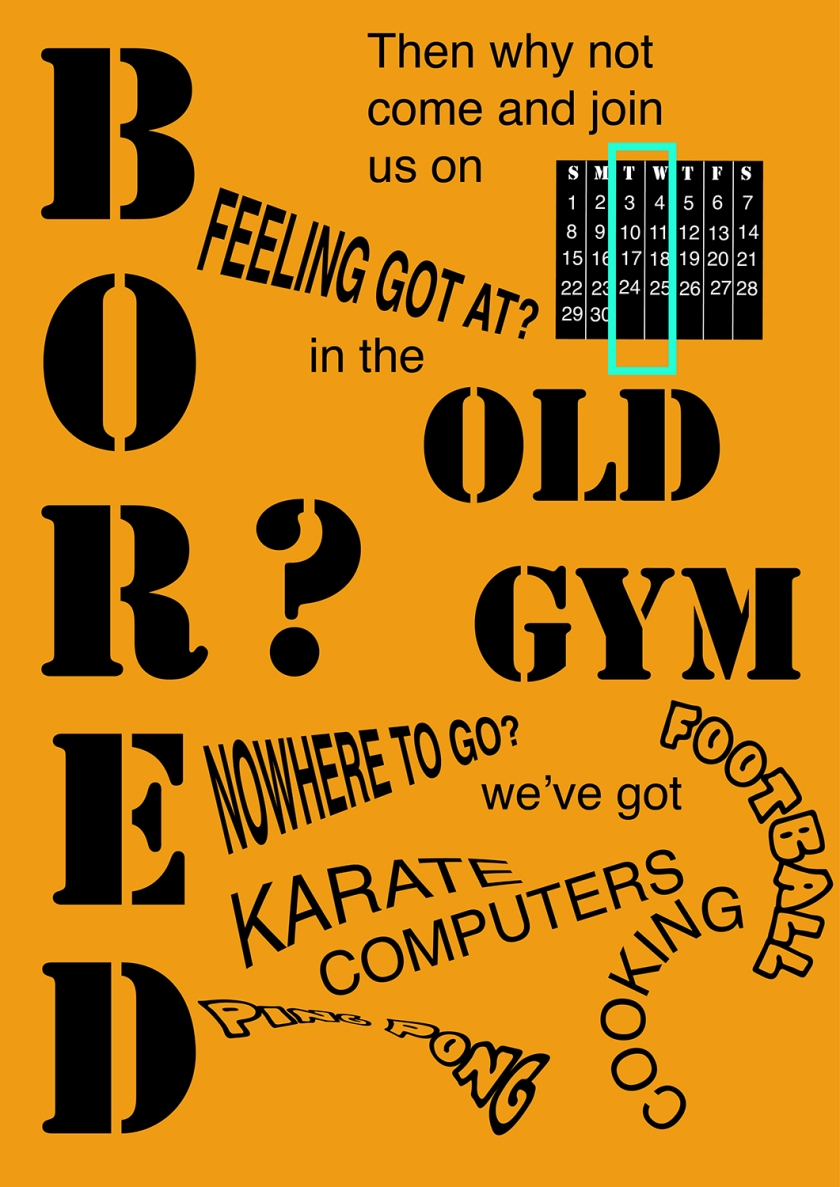
A poster to advertise an after-school club for boys aged 13 – 14. The poster will be A3 size and the copy reads: “Bored? Feeling got at? Nowhere to go? Then why not come and join us on Tuesdays and Wednesdays after school in the Old Gym. We’ve got football, ping pong, table soccer, computers, Karate, cooking and lots more. All free just come along.”
Your friends’ engagement party. They want a flyer A5 size to send to their friends as if advertising a club night. The copy reads: “Mandy and Josh are finally going to do it…well almost!!!!! Come and join them on Friday 24 March from 8pm at the Golden Calf to celebrate their long awaited engagement… and yes lots of presents would be gratefully received particularly if we can drink them!!!!!
Then have a go at mocking up each of these. Try different fonts to see how each changes the feel of the text and make notes in your learning log about which works best and why.
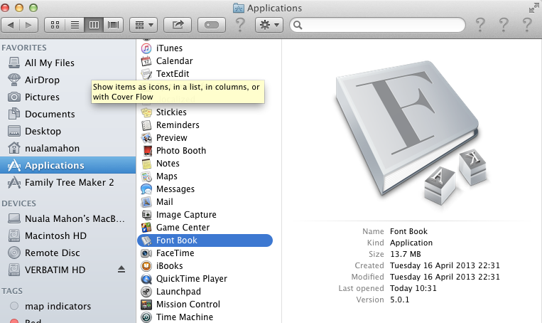
The first thing I discovered is that I have something called Font Book on my MAC where all the fonts are stored. I researched how I could use this application to organise my sample book.
There are many available software applications for organising fonts. Since I am not planning to be a graphic designer I decided to use the Font Book provided on my MAC.
I created my own collection of serif fonts. Unfortunately I learned that one cannot delete a collection(incorrectly set up) – just disable it – weird…. I also failed to make a ‘smart collection’ as I did not know the correct terminology for how to limit what would go into this collection….
I found a list of Fonts supplied with MAC OS X in Wikipedia. I found this could be sorted into subtypes e.g. Sans serif. So I did this sort. Then I copied and pasted the result into EXCEL. I added a column for the Appearance for which I used FontBook.
I then rationalised this by creating shortcuts for the classification subtypes (B for Bold etc.). I ordered the different classifications (serif, sans- serif etc.) into sub classifications using this sites’ classification system which seemed to me to be logical. But I did run into limitations. Many of my FontBook typefaces seem to fall into odd sub categories. I used Wikipedia’s classification in some cases. Not sure if this is “Beginners License”…..
I will add to this list as I add more typefaces to my computer.
Now identify which fonts you might use in each of the following commissions:
1. A short story in a woman’s magazine entitled “I thought I loved him; now I’m not so sure”. The story is 1300 words long so you will need to identify a text font and a headline font.
The principal concerns when combining typefaces are the following:
contrast (not too similar and not to drastically different)
weight (combing typefaces of different weights)
style and decoration (normally regular or italic are used to create style. Decoration is created by drop shadows)
scale and hierarchy (e.g headings should be bigger than sub headings and body typefaces)
classification (use different classifications e.g. serif with sans serif)
structure (structures should be either VERY similar of very different)
colour & texture (for contrast in similar typefaces use colour or texture)
extreme contrast (for display or script typefaces use extreme contrast)
mood (choose a typeface that reflects the mood of what you are designing e.g serious, fun)
Another paper I read with the title “Setting body text for comfortable reading” says:
The body text is most important for ease of reading. We only notice if it is wrong and should be unnoticeable if it is correct.
The paper suggests Caslon, Jenson, Chronicle, Miller, Palatino, Garmond and Goudy are easy to read. While Didot and Bodoni are not because they are not intended to be read at small point sizes. He suggests that body text sizes can range from 9pt to even 12pt.
My husband looked at these and decided that Gill Sans and Caslon was the easiest and best combination to fulfil the above criteria. So I set this up in InDesign. I have used PageMaker many years ago so the flowing text and bleeding came back to me….
Here is the final result:
I am now going to write a best selling version of Fifty-one Shades of Grey……
RESEARCH FOR NEXT PART:
Before starting the next part of this exercise I wanted to research graphic designers who worked especially with typography. I have added these to my page on graphic designers.
With my head exploding from the work of these contemporary designers I set about trying to create some meaningful designs…
I did some sketches, in my log book, for all three assignment tasks. Nothing really pleased me so I went to Illustrator and Photoshop to see if I could get inspired – not really. Back to the sketch book and I picked some ideas rather than the totality of any one sketch.
Below are my sketches in my log book.
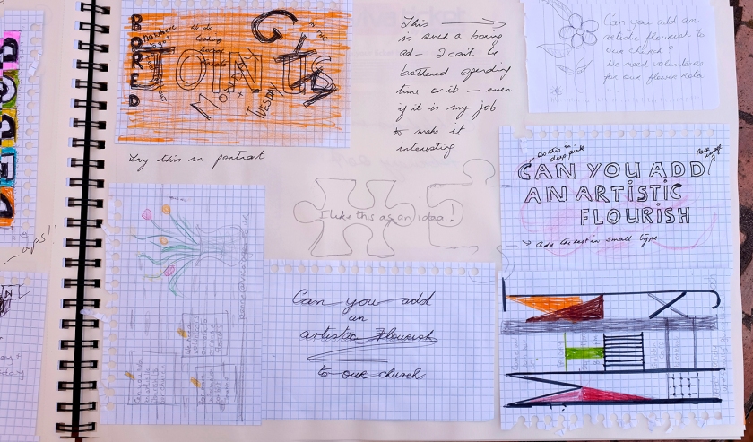
1. An advertisement in a parish magazine asking for more helpers on the flower rota. The finished size is A6 landscape and the text reads: “Can you add that important artistic flourish to our church? We desperately need more volunteers to join the flower rota. If you can help or would like more information please contact Jennie jennie@vicarage.co.uk.”
I came up with two designs.
This one my husband declared illegible and he totally missed my artistic efforts of tucking some of the type behind the flower! Since the ad would not be focused on anyone like him, as he would not be helping with any church flower rotas, I tried to defend the work. But in the end I had to agree. The amaryllis (my own image) was too strong. The type chosen was not legible enough.
For my second attempt I went for a walk and picked some wild flowers. I typed the words “artistic flourish” in script on a piece of white paper, reduced the opacity, and added the flower buds and grass to partially cover the words. I had seen a young female designer do something like this (albeit with a lot more skill) online. I then photographed it and made an artistic(ish) brush stroke around it in Photoshop. I picked the colour of the background and increased the canvas size . I then imported this into Illustrator and added the remainder of the text. I think it is wishy washy but maybe that is what might attract the people who would be offering to arrange the church flowers….
2. A poster to advertise an after-school club for boys aged 13 – 14. The poster will be A3 size and the copy reads: “Bored? Feeling got at? Nowhere to go? Then why not come and join us on Tuesdays and Wednesdays after school in the Old Gym. We’ve got football, ping pong, table soccer, computers, Karate, cooking and lots more. All free just come along.”
This was much more my style. I liked the idea of a bold background colour and some interesting typefaces. I also wanted to play with some effects like warp in Illustrator. I hope I have not overdone it. The main words are in Stencil Std Bold. Helvetica for the the request to join the club and graffiti or helvetica for the activities.
3. Your friends’ engagement party. They want a flyer A5 size to send to their friends as if advertising a club night. The copy reads: “Mandy and Josh are finally going to do it…well almost!!!!! Come and join them on Friday 24 March from 8pm at the Golden Calf to celebrate their long awaited engagement… and yes lots of presents would be gratefully received particularly if we can drink them!!!!!
For this there was three pieces of important information. Whose party was it, what date and time and where it was to be held. I wanted to improve my illustrator skills and I liked the idea of two jig saw pieces not quite fitting because of the text ” well almost”. Creating the two jigsaw pieces was a marathon learning curve and I did not finish the tutorial to achieve the beautiful pieces being illustrated. However I was happy to have learned a little about creating a 3D effect, rounding the corners and moving anchor points.
The design I came up with is a simple clean one which I would like myself.I would hate hearts or rings or guys down on one knee. I tried many fonts before I settled on Apple Chancery for the heading and top information, Avenir Next for the main body of information which I felt had to be very clear and Lucida handwriting Italic for the post-it. I hate the idea of asking people for presents so I put it in as an after thought yellow post-it. I think it would be cheap to print with only three colours.
REFLECTION FOLLOWING TUTOR FEEDBACK:
I am most drawn to your cut flower type as I like the novelty, the colour and the intrigue. This example may be over complicating a task which is primarily focussed on the use of appropriate existing fonts however, I think this is the most effective image due to a clear hierarchy where your subordinate fonts and colours allow the title imagery centre stage. This image is also grounded in influence and research – you saw something you liked and you tried to replicate the style and language. Whilst a designer must be careful not be overly derivative this deconstruction of existing imagery to influence and assemble you own designs is an essential part of making more sophisticated work, so please look to continue to structure this element of the process into your methodology. For me this might include questions at the start of a project like this:
What design already exists that fits the purpose of the brief? (and how would I go about replicating this / do I have the skills and do I understand the steps and methods?)
Do any of the current designs on the market satisfy me? Is there a particular niche that I am drawn to? How could I make MY design fit in with this and push it towards the art and design and tastes I am drawn to?
Do I need to broaden my tastes and knowledge? What do I need to look at that might give me inspiration for newer, more innovative design?
It is very rare for me to do a piece of design work without using numerous bits of direct visual reference to construct it – these are like pieces of a jigsaw puzzle to reappropriate and assemble my own work based on a field of semiotic influence.
I am not really sure how to interpret this feedback. On the one hand my tutor liked my created ‘typeface’ but on the other it did not fulfil the brief. I am not sure if my other efforts fulfilled the brief better or less well.
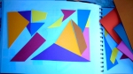
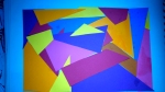
Create a series of 10 abstract designs in which you balance blocks of subordinate, dominant and accent colours.
These designs are going to be used as covers for guidebooks to the following cities:
Madrid Malmo Managua Manchester Manhattan Marrakech
Marseilles Melbourne Montreal Mumbai
The books are going to be A5 landscape (210mm x148mm) size. You can use as many colours as you like and need to include the name of the city – where you place this and its colour are also important decisions to make. You may want to find out more about each city to help you develop your colour palette and also the size, shape and positioning of the colour blocks.
Explore your DTP packages further by creating the artwork in the different software packages you have to experiment with the possibilities and ease of use. You can also do this exercise on paper using coloured blocks that you can cut and move about.
Make notes in your learning log as you research and create your designs.
This slideshow requires JavaScript.
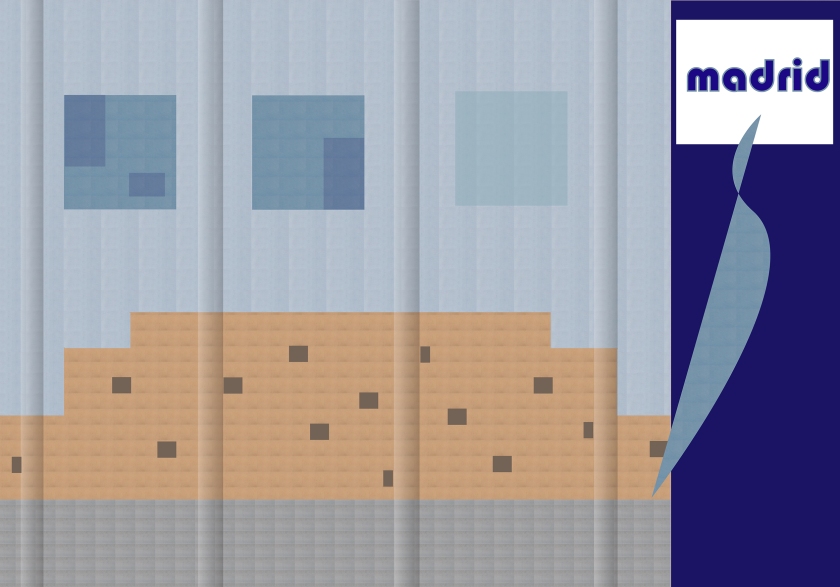
Madrid:
I decided to start with the two cities with which I am familiar, Madrid and Marseille. I had the following image of Madrid which I used to create an abstract in Illustrator. For learning steps see my log diary.
I kept more or less the same colour scheme and created the following abstract which has the proportions 210 x 148 cm.
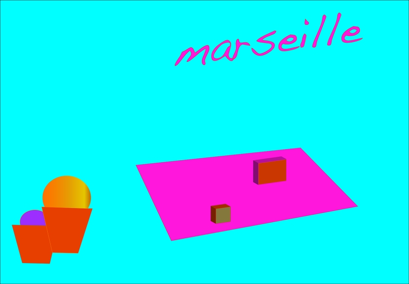
Marseille:
I decided to do Marseille next. I had already used another image to try out an abstract in my log book. However I preferred these colours and the simplicity of these meant that to size it was easy.
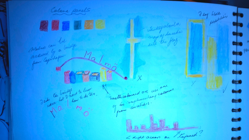
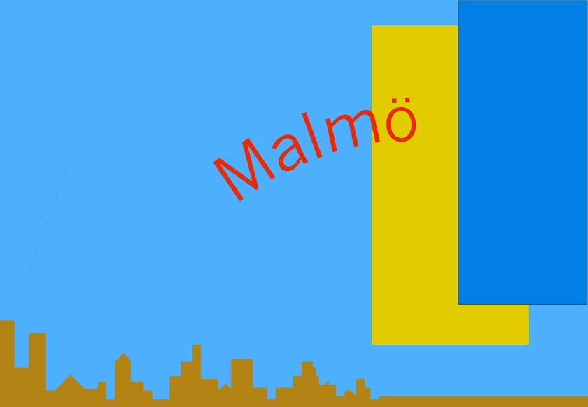
Malmo:
I have only visited Malmo once in my life and that was about thirty years ago. I was on a train with three children passing through on my way up north in Sweeden.
I can remember nothing except trying to herd three children on to a train with a hoard of people.
So for inspiration I started with the Swedish flag. I found the ‘official’ colours online and put these into the swatches in Illustrator. I tried several shapes and ideas in my log book. I also found colours which were close to and contrasting with the swedish flag colours. I saved this in the swatches. I used these to create a skyline across the bottom and a contrasting colour for the name.
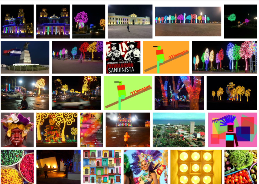
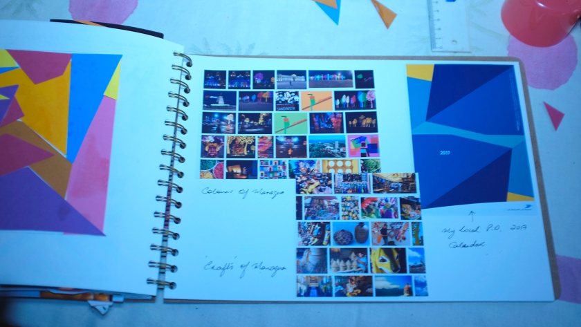
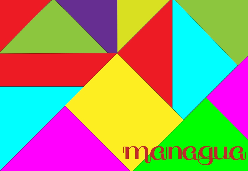
Managua
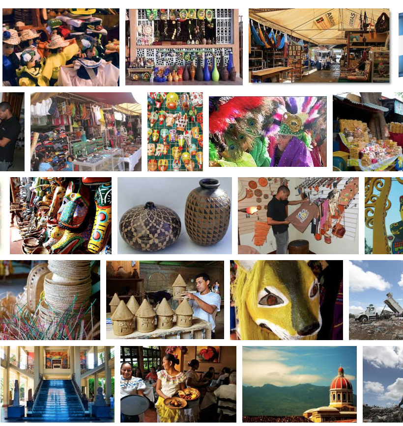
I’ve never been to central America so I had very exotic images in my head. I did not know exactly where Managua was so I had to start researching it. It’s the capital of Nicaragua and is home to just over 1 million inhabitants. It is almost completely surrounded by water. It has suffered greatly from volcanoes and if Google is to be believed most people beat a hasty retreat as soon as they can.
For this reason I felt obliged to give Managua a touristic boost by trying to design a cover which was as vibrant as possible…
I started with looking at the general images but decided to go to ‘crafts’ Managua as my search term. This is a screen snap of page 1.
I then searched ‘colours’ Managua and this is what came up. Again a screen snap of the page.
I used the above images to match some of the colours in Illustrator and made a new group of them. Below are the colours I assembled.
I wanted a random set of shapes for my cover. I received a 2017 calendar from my post office a couple of days ago and I liked the design. With this design and the images and the colours I cut out a number of shapes and made a collage of them in my log book.
This is the type of design I wanted to create in Illustrator for Managua. I also wanted something south american for a typeface. I found South Pacific on DaFont. Am not convinced about it.
I think this looks a bit gaudy and amateurish. So I produced another.
I am not sure which would make me buy the guide book!
After a lot of trial and error I came up with this abstract design and I quite like it. I learned a lot about creating triangles!
I still do not know if I would choose any of these as an inviting guide book cover… I await critique.
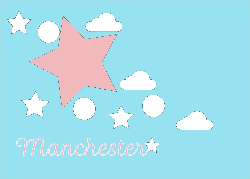
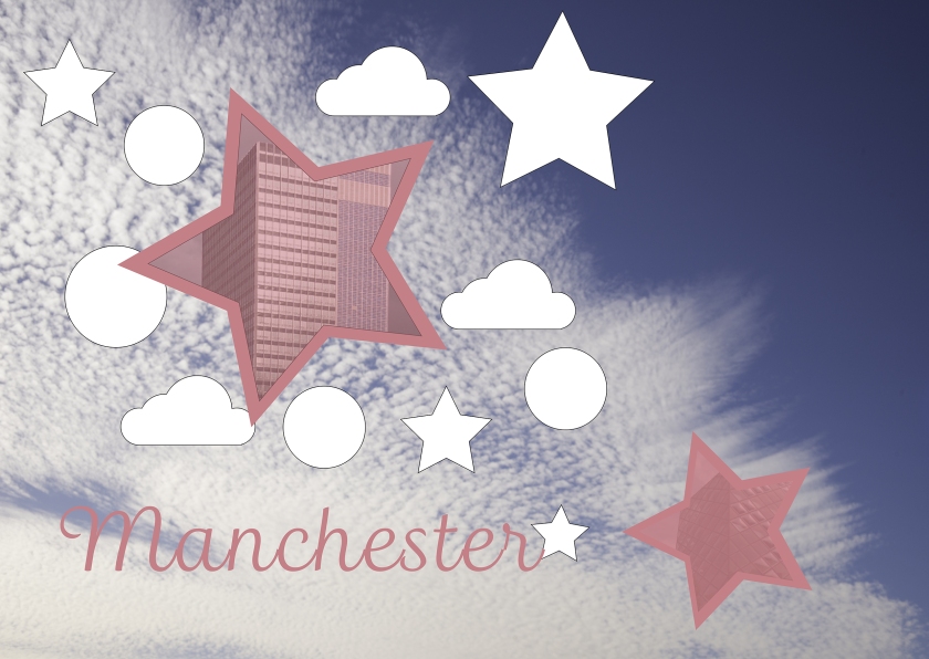
Manchester:
I looked at some guidebooks online for Manchester and did not altogether like what I saw. I quite like the one at the bottom.
But I don’t much like mine either…
It reminds me of a child’s bedtime story book. Maybe I need to rethink this.
I wanted something more lively so I located one of my sky images. The added a few coloured stars with images of Manchester buildings behind.
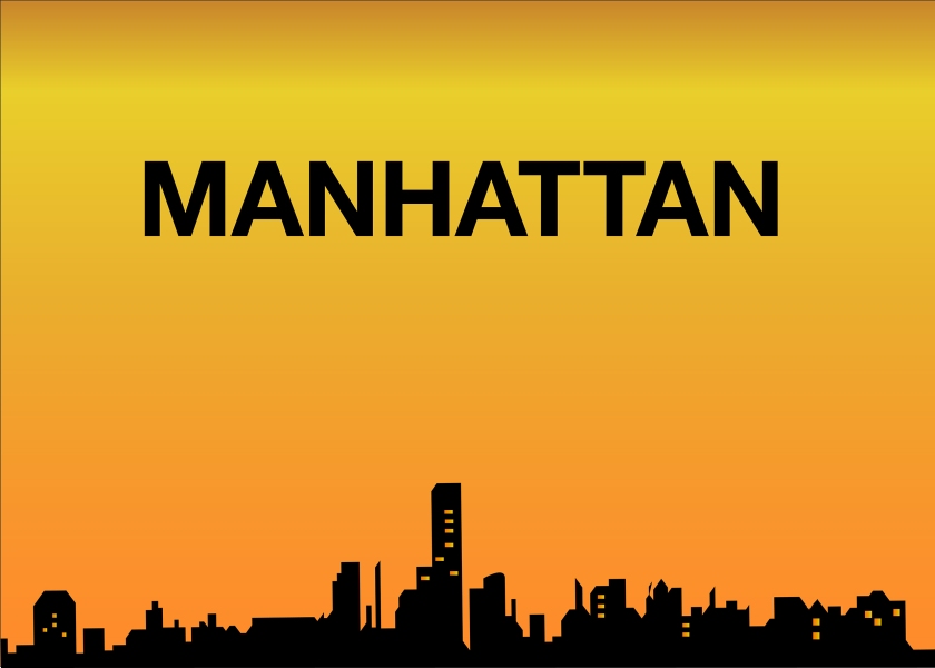
Manhattan:
I want to do a skyline in black with an orange sky and orange windows in the skyline houses. I have been thinking about this. For me Manhattan is nighttime entertainment. Google images produced this page. I don’t find the images especially inspiring..
I picked one of these images, converted it to black and white and placed it in my Illustrator blank file. I stretched to fit and reduced the opacity. I then used the pen tool to trace the outline. When completed and I had a closed path I removed the background image. I then filled the outline with black and placed one of the very few gradient colours available. I need to learn how to create gradients. The orange suited well but needed to be rotated to fit sundown direction. Finally I wrote Manhattan in Helvetica as I wanted it to be clean and bold.
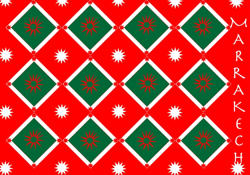
Marrakech:
I tried to make a moroccan shaped door but that did not work so I decided to go with the pattern idea. Not sure if this really fulfils the brief of block colours but here goes.
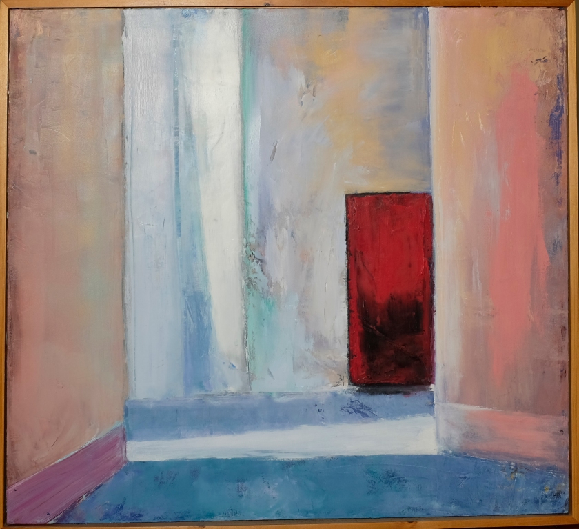
I remembered my beautiful picture painted by a friend who spent the Winter in Marrakech a couple of years ago. I bought the painting for my husband’s birthday and we both love it. So I decided to take a picture of it and reduce it to blocks of colour.
Kordula Packard
This probably fits the brief better but I like it less and I learned no new skills while creating it…
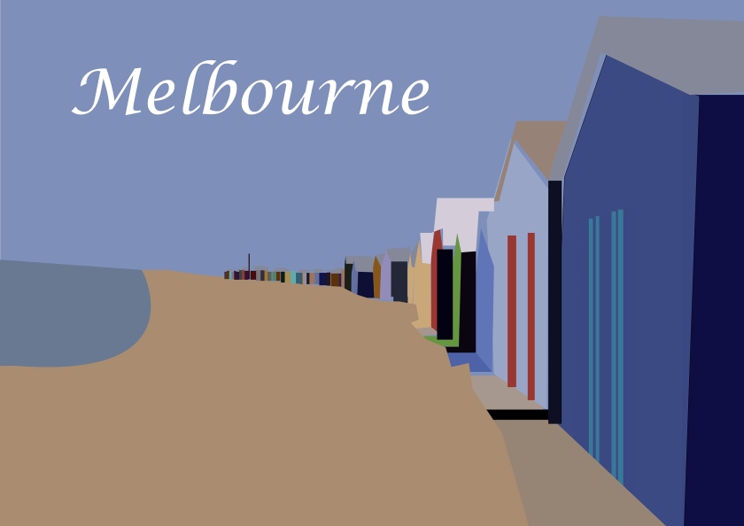
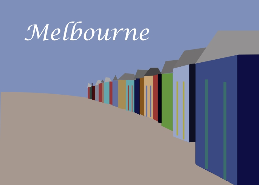
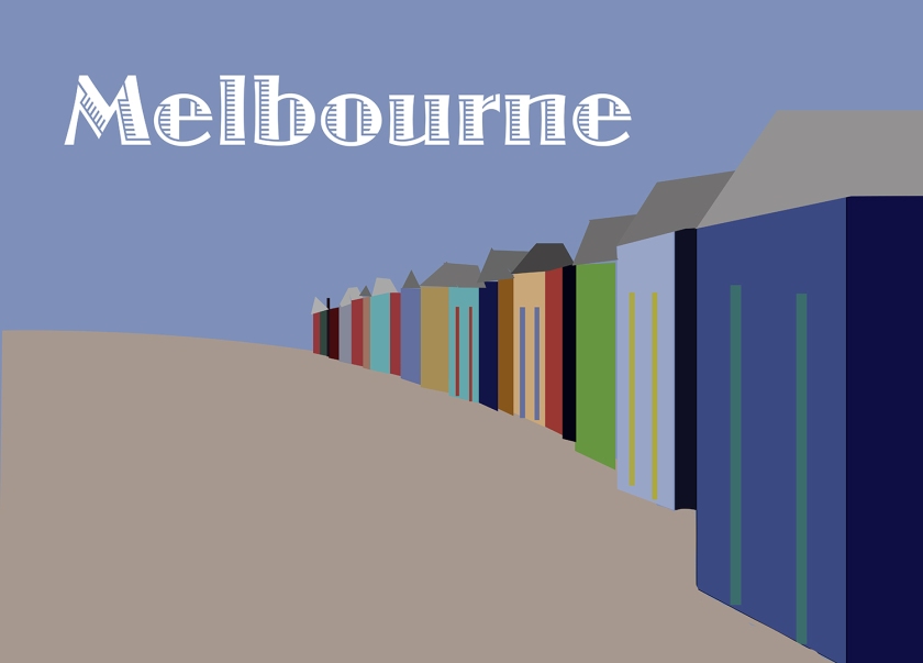
Melbourne:
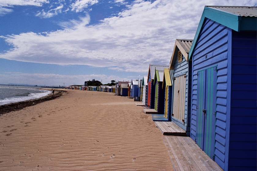
I visited Melbourne in 1996 and I had a very simple camera with me but I took some images I like so I will se one of these.
I am not too happy with what I made of this as I think it is too complicated but here it is.
I have tried to make this simpler and cleaner
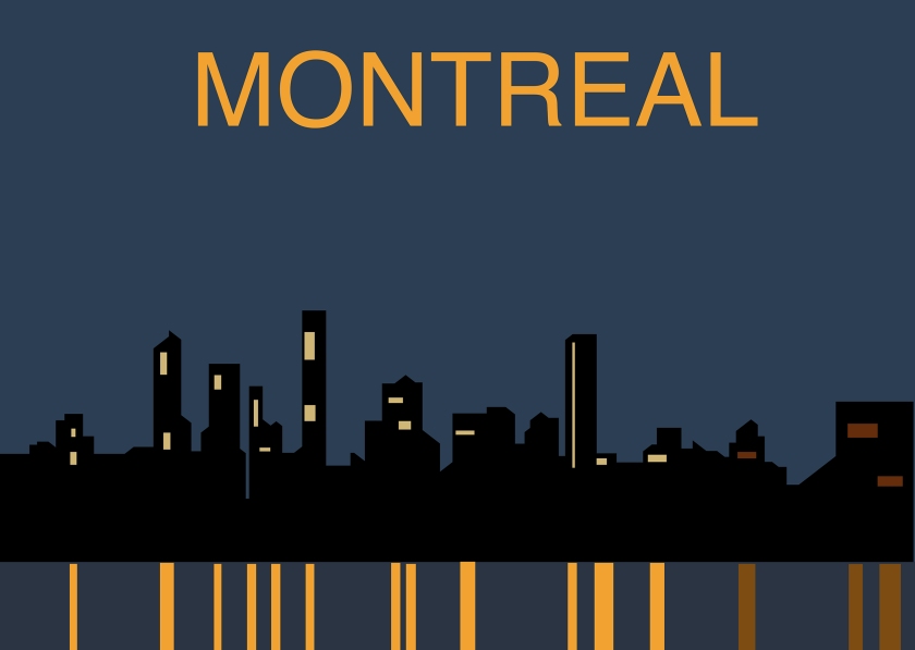
Montreal:
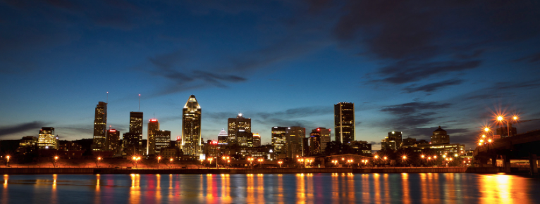
I used the image below from the internet to create my Montreal illustration:
This is what I came up with:
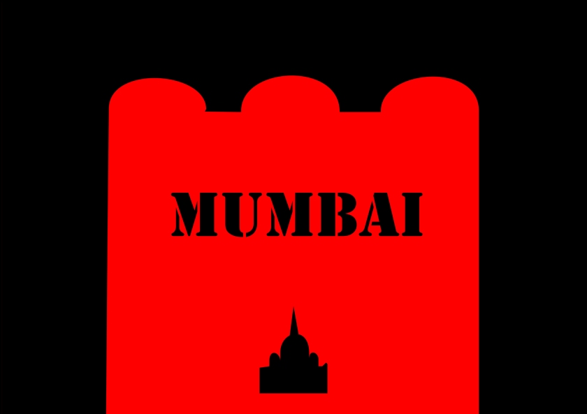
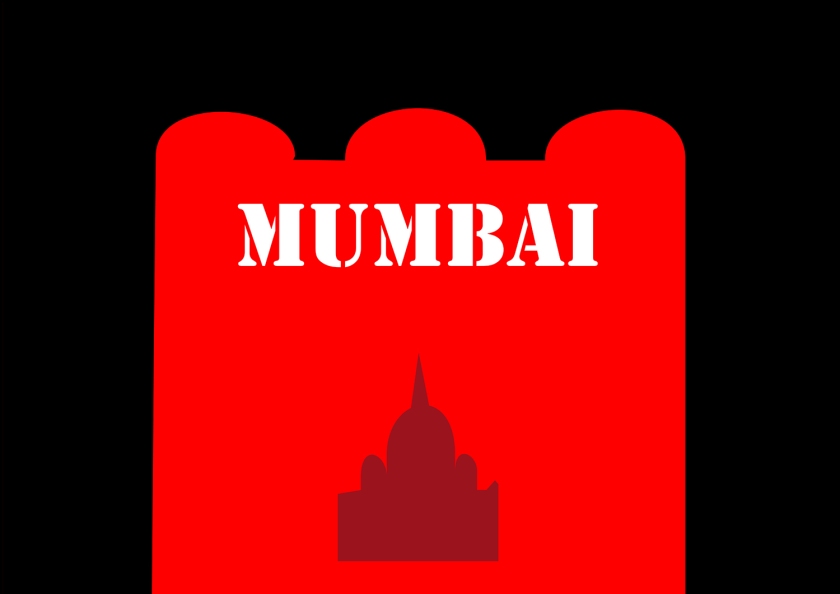
Mumbai:
I have not been to Mumbai but have spent time in other parts of India. I will look at some of my own images to create the atmosphere of India in my head. I always think of India in terms of the colours oranges and reds. I think about India as a cacophony of noise. The traffic is manic. But the people are charming and very attractive. I love the beautiful red and black saris worn on festive occasions. So I used this for my inspiration. Of course India is temples. I remember feeling’templed out’ while there!
REFLECTION:
This has been an extremely difficult exercise for me. I decided to do all the cities in Illustrator as I felt this was the best software to use. My knowledge of Illustrator was very limited but I feel I have learned a lot about creating shapes and especially curves. However I am far from confident that I can reproduce some of the effects I was able to create. I do not find Illustrator intuitive and I get very frustrated. I think I have perfected something and when I come back to it it does not seem to work. I know this is because I am not doing something correctly but it is not always evident.
When I checked other students work I see they mostly produced real blocks of colour but I wanted to extend my knowledge of Illustrator so I strayed from the brief a little I think.
I have been reading Itten’s book on the art of Colour while I have been creating these illustrations. However I have not been able to use any of this knowledge for several reasons. I am not sure enough of how to use different colours. I have tended to go with my gut reaction. I will be extremely interested to learn what my tutor thinks of my choices and how these could be improved with an improved knowledge and familiarity of the colour circles, hues, saturation, harmonies etc.
I asked for some feedback on a couple of my works, from friends and altered according to their suggestions:
Sandi says:
Mumbai, like use of back and red, like the shape but it needs more. I would suggest, move up text Mumbai, make white. Make your Temple bigger and make it red but 15% darker. I would suggest for the black having some kind of tonal graphic but if your just getting your head around illustrator that could be difficult.
MElborne: font is very dated, I would something contemporary not script. Really like the graphic illustration here, good job! Oh and make MElborne text bigger.
MArrakech: the colours are too similar to MElborne to distinguish this as an entirely different piece. I would just make them bolder, pillar box red, gold, all those bold colours you associate with Morocco. I think these bolder colours could be your center piece but have more muted colours (the blues are good for this) at the side and bottom blue is good with that. Make the two side panels exactly the same on each side the different angles are distracting. They should essentially lead the eye into the vibrancy of the center piece!
I have left my original ideas to see what the tutor thinks.
17 Jan2017: Have just finished Beware Wet Paint by Alan Fletcher and found his interpretation of Manhattan…. How simple – How beautiful
REFLECTIONS AFTER TUTORS REPORT:
I think this task shows your own preference towards pictorial imagery which has a clear visual legibility. Where your images have become over-simplified and you lose an anchor or means of justification the images seem to lack a satisfaction for you. I think this task is not about right or wrong but more to do with discovering where the line could be drawn between graphic reduction and the thoroughly abstract… and most importantly, where you might enjoy working on this scale! There’s some great colour exploration here alongside broad exploration of shape. I think the Manchester image feels the least effective – what about artists like Lowry? – what palette and shapes are his images made up of? Could you form some of these simple shapes in illustrator and then scatter them and rearrange them and would the image still denote a feel Manchester. Your Montreal and Madrid images feel most sophisticated in their refinement. Including Fletcher’s work at the end summaries nicely a knowledge of the purpose of this task being related to understanding simple graphic form and language. I also rather like your Managua image! Whilst you might not like the refinement of this, there’s something about using the triangles in a pattern that has a lively dynamic that starts to remind me of central american primitive folk art or pattern.
With my tutors advice I took one of Lowry’s paintings and studied the shapes. I simplified it and came up with the following design. I left the colours deliberately muted to denote industrial Manchester but I hope it does not appear took dull and uninviting!!!
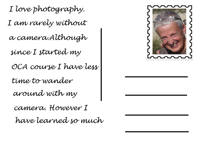
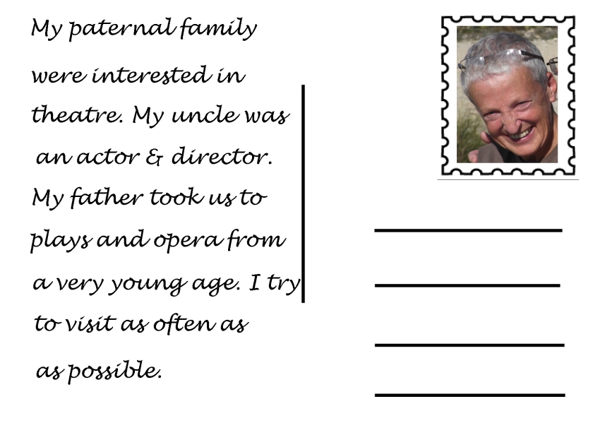
This first assignment is about introducing yourself so that your tutor can get to know you, your interests and your work better. This assignment is not submitted for formal assessment. Design a series of at least three postcards (final size A6) that say something about who you are, your interests in graphic design and your wider cultural influences or interests. You can use any medium or materials you want to. You may want to work much larger and reduce your artwork to submit it. Don’t forget if you do this that details may get lost. Use the front of the card to present your designs while on the back of the card say something about what this image means to you or why you chose it. Keep notes to accompany the making of the cards in your learning log. These notes could cover why you decided to portray what you did, what you included and what you omitted.
I started this assignment by asking members of my family to make a postcard or postcards using a word or a picture, or both, to depict how they see me. I have included these in my physical learning log. My favourite was my three year old granddaughter who said “BaNana” – she loved her own joke. My daughter drew a banana for her as her contribution.
I made a list of words that I thought said something about me:
photographer
gardener
reader
traveller
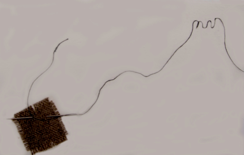
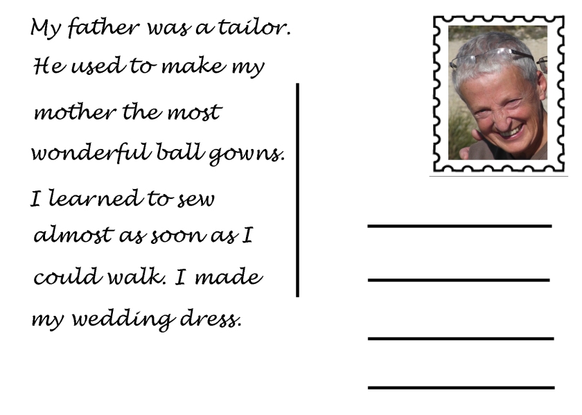
sewing
cooking
family
arts & crafts
the sea
I worked on these ideas trying to use what I was learning about design. I tried to keep the cards simple and self explanatory. I added a description on the back of what the card was about or why I chose it. In order to define the card size I have framed each one with a black line. This is not on the original cards.
Here is my final selection:
Reflection on this assignment:
I am on a very steep learning curve here. I know nothing about graphic design other than commenting on what I like and do not like around me. I am not sure if I will get much out of this part of the course as there seems to be so much to learn. Because of my lack of experience I decided to keep my first assignment simple. I also do not like cluttered design so this fitted in well.
I hope you will learn something about me from my simple postcards
 The heading was in Franklin Gothic pt size 36. The body of the text was Helvetica Neue 14pt with the questions in the same font but Bold. Because this is online the pt size used is bigger than it would be in an equivalent printed magazine. Sans serif also reads very easily online. Both heading and body text are clean and simple.
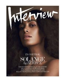 The next magazine I looked at was called, appropriately “Interview”. I loved the cover. The online interview was in Georgia 14 both questions and answers, The questions were in Upper Case.


 There are many available software applications for organising fonts. Since I am not planning to be a graphic designer I decided to use the Font Book provided on my MAC.
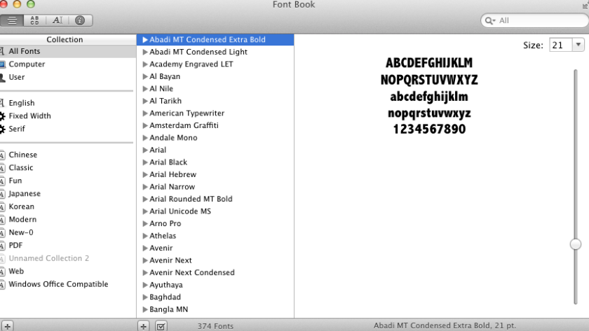 I created my own collection of serif fonts. Unfortunately I learned that one cannot delete a collection(incorrectly set up) – just disable it – weird…. I also failed to make a ‘smart collection’ as I did not know the correct terminology for how to limit what would go into this collection….
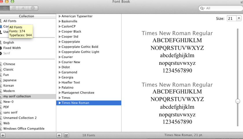 I found a
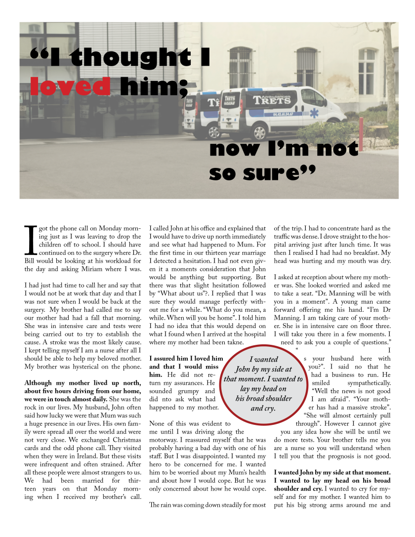
 I am now going to write a best selling version of Fifty-one Shades of Grey……
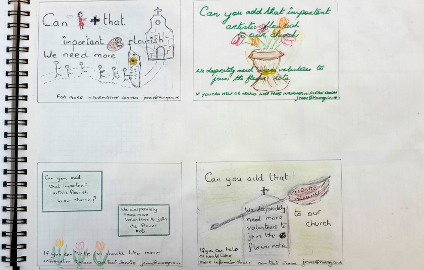
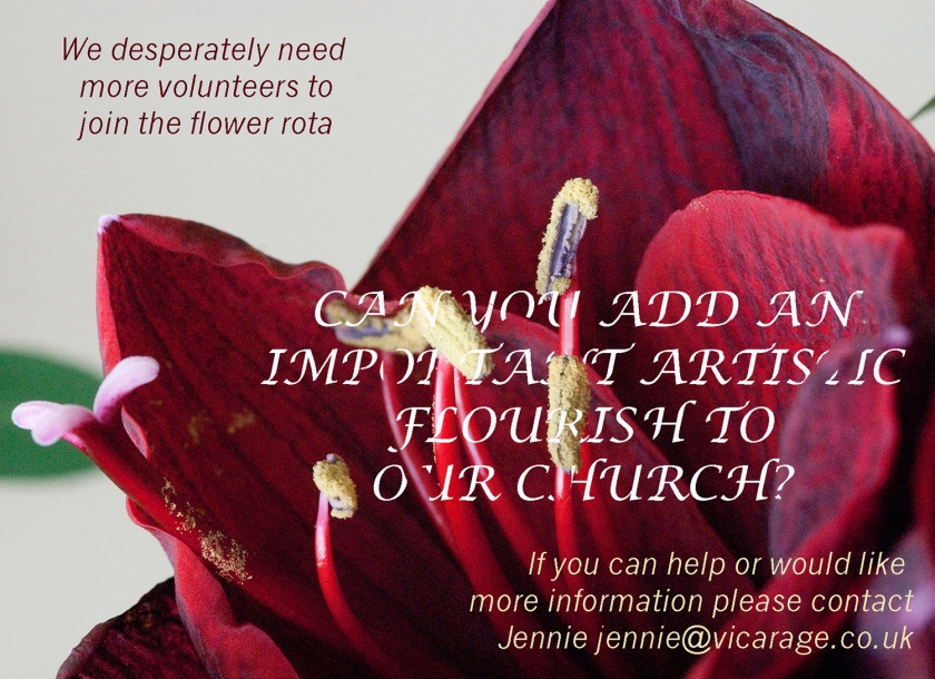 This one my husband declared illegible and he totally missed my artistic efforts of tucking some of the type behind the flower! Since the ad would not be focused on anyone like him, as he would not be helping with any church flower rotas, I tried to defend the work. But in the end I had to agree. The amaryllis (my own image) was too strong. The type chosen was not legible enough.
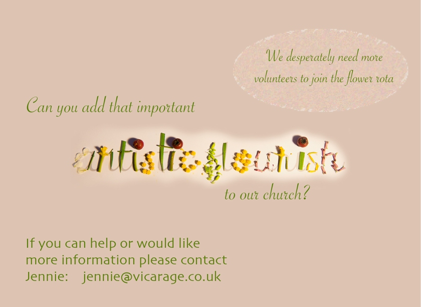
 3. Your friends’ engagement party. They want a flyer A5 size to send to their friends as if advertising a club night. The copy reads: “Mandy and Josh are finally going to do it…well almost!!!!! Come and join them on Friday 24 March from 8pm at the Golden Calf to celebrate their long awaited engagement… and yes lots of presents would be gratefully received particularly if we can drink them!!!!!
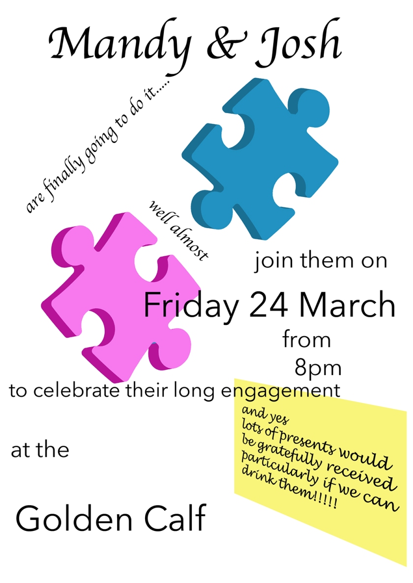

 I picked one of these images, converted it to black and white and placed it in my Illustrator blank file. I stretched to fit and reduced the opacity. I then used the pen tool to trace the outline. When completed and I had a closed path I removed the background image. I then filled the outline with black and placed one of the very few gradient colours available. I need to learn how to create gradients. The orange suited well but needed to be rotated to fit sundown direction. Finally I wrote Manhattan in Helvetica as I wanted it to be clean and bold.